For this year’s Atlanta Symphony Orchestra Showhouse and Gardens, I was delighted to be the designer for the Son’s Retreat
– an upstairs suite complete with “Juliette” balcony overlooking
the gardens and terrace. Last year, our Butler’s Pantry was an absolute blast of a time, and this
year was notwithstanding.
My inspiration for this room’s schematic came from
a real life situation – you return home to your parents’
home but you return home with maybe a wife or even a wife and family!
Well, not a situation for me actually, but a situation many folks are
finding as they marry and return home for a visit. For my BFF Maggie, she was challenged with this scenario – do you
bring your spouse into your room chocked full of pompoms, pink ribbons
and dried prom flowers? Or, from the husband’s standpoint, do you
bring your wife home to your Legos, first buck and pheasant and bass
on the wall or your baseball cards?
Maggie did a terrific job at her parents’ home transforming a bedroom into a suite suitable for her and husband as well as her brother and his bride. I thought about this for the Showhouse – what would a son want for a retreat for not only himself but for his family too? Well, I thought to myself, “Self, you are a son too, and you would love to retreat to a comfortable room with great lighting, handsome accessories, a calming color palette, reminders of childhood, reflections from nature and somewhere else besides the bed to sit and relax. Put my thoughts and some “manpower” from the gals at James Farmer Inc, and our dream was made into reality! NOTE: I don’t make the gals from my office do all the heavy lifting – Martin Hunt with McCorquedale Transfer does give the girls a helping hand if the armoire is too heavy! Ha!
I love blues and greens. Muddle their tints and tones and my love for everything from indigo to aqua comes to fruition with my designs. I also love a mix of high and low; textures and tactile elements; and varying art mediums to achieve an overall “look” – an overall feel and thus accomplishment of a dream, inspiration and vision.
I like to tell me clients, one of the best ways to address a room’s use is its title. This room is a bedroom – a retreat too, but a bedroom. A bed should thus serve as the cornerstone. What does a bed need? A mattress and box springs of course, but is this bed for one person, two people, a couple of dogs or a cat too? Linens and lighting – will the bed’s occupant merely sleep in bed or will they read too? Will they have a glass of water to take to bed? If so, what type of surface will suffice to place this drink?

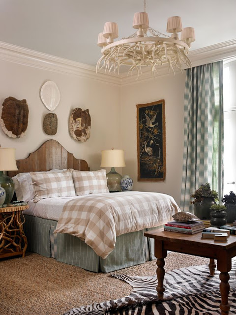
I love balance and symmetry. A pair of lamps on matching stands, chests or tables make a bed feel anchored. So with the headboard in place (a pine design I loved for its simplicity and, well, because its pine), I kept the feel of its makeup by using two pine and mountain laurel round tables that have the feel of an English cricket table too. Sea glass hued wine bottles turned into lamps afforded the bed some light too. As for the linens proper, I kept with my motto of simple is best for bed linens. Everything from a traditional buffalo check from Ikea, to a lovely matelasse from my friends at Heery’s Too and some custom monograms from my friends at Initial Reaction in downtown Perry made the bed akin to a good gentleman’s outfit – khaki and white, handsome and classic for just about any occasion.
The windows too were dressed like the bed – very simply yet tailored and elegant. An aqua ikat check (ikat and check – does it get any better?) as panels framed the doorway that let out to the sweet Juliette balcony. A custom built cornice heralded the window treatments for a topper and added some architecture as well.
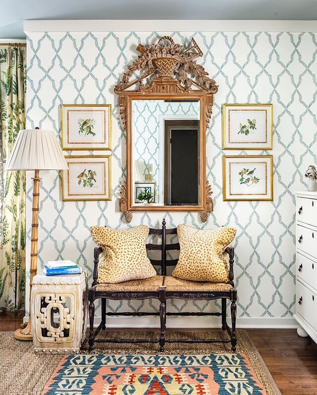
The Showhouse had gorgeous dark, stained oak flooring throughout, so a simple jute rug that is luxuriously soft underfoot was our foundation. A zebra hide angled under the pine coffee table gave a nod to the “wild side” but grounded further our color scheme of soft blues, creams, sepia browns, aqua and greens. Aside from the bed, the other major piece to anchor the room was my cherished aqua velvet canapé from France. The velvet is original and the dark stained legs complement the color so well. The nailheads and curves play along harmoniously and of course, fabulous pillows are a must! Chevrons in my colors and a couple ocelot patterns too gave this antique some rejuvenation and pizzazz!
Of course too, birds, turtle shells and bamboo factored into this room’s schematic. There is no denying that I love birds in artwork, painted on plates or mounted after a hunt, thus, a bird print or two, bird tapestries and a mounted pheasant too found their way into the room – or onto the walls more so. A grouping of turtle shells arrayed over the head board are a nod to a classic fauna-style décor.
Bamboo too in the form of a side chair, mirrors, bathroom shelf and even on a chest further supported my moxy of always using your favorite things in your designs. With the bamboo chest also made of pine, well, how could one go wrong? A chunky, duck/robin’s egg hued framed mirror reigned over the chest with a finial of antlers to keep my love for nature in check.
Further enhancing my color scheme and design aesthetic was the absolutely fabulous oil painting I found in a friend’s booth at Peachtree Battle Antiques. This monumental painting depicts a scene off the coast of Maine, and the gilded frame highlights the deep blues, greens, browns and muddied colors in between. This painting also added maturity to the room too, but further attained the mix of “high and low” that I so love – especially since the chandelier (a PBA find too) was simply an antler chandelier painted white yet ever so chic too.
Another Farmer fave – a blue painted ceiling! Such a statement is reminiscent of porch ceiling across the South and I tend to use blue as my ceiling color choice. Benjamin Moore has two colors in particular I love to use, Ice Cap and Palladian Blue or watered down shades in between – depending on how blue or gray or green I wish the ceiling’s treatment to be. Wall color ended up being a watered down (usually by cutting the paint down with Benjamin Moore’s Linen White) version of Coastal Fog. Ice Cap and this Coastal Fog reduction are a terrific pair for just about any room.
From birds to blues, turtles to tables, aquas and accents galore, this year’s room at the ASO Showhouse was so much fun. I cannot thank this organization enough for their hard work and dedication, and I hopefully look back to more ASO Showhouses to come. From this Farmer’s retreat to yours, happy decorating ya’ll!
Maggie did a terrific job at her parents’ home transforming a bedroom into a suite suitable for her and husband as well as her brother and his bride. I thought about this for the Showhouse – what would a son want for a retreat for not only himself but for his family too? Well, I thought to myself, “Self, you are a son too, and you would love to retreat to a comfortable room with great lighting, handsome accessories, a calming color palette, reminders of childhood, reflections from nature and somewhere else besides the bed to sit and relax. Put my thoughts and some “manpower” from the gals at James Farmer Inc, and our dream was made into reality! NOTE: I don’t make the gals from my office do all the heavy lifting – Martin Hunt with McCorquedale Transfer does give the girls a helping hand if the armoire is too heavy! Ha!
I love blues and greens. Muddle their tints and tones and my love for everything from indigo to aqua comes to fruition with my designs. I also love a mix of high and low; textures and tactile elements; and varying art mediums to achieve an overall “look” – an overall feel and thus accomplishment of a dream, inspiration and vision.
I like to tell me clients, one of the best ways to address a room’s use is its title. This room is a bedroom – a retreat too, but a bedroom. A bed should thus serve as the cornerstone. What does a bed need? A mattress and box springs of course, but is this bed for one person, two people, a couple of dogs or a cat too? Linens and lighting – will the bed’s occupant merely sleep in bed or will they read too? Will they have a glass of water to take to bed? If so, what type of surface will suffice to place this drink?

I love balance and symmetry. A pair of lamps on matching stands, chests or tables make a bed feel anchored. So with the headboard in place (a pine design I loved for its simplicity and, well, because its pine), I kept the feel of its makeup by using two pine and mountain laurel round tables that have the feel of an English cricket table too. Sea glass hued wine bottles turned into lamps afforded the bed some light too. As for the linens proper, I kept with my motto of simple is best for bed linens. Everything from a traditional buffalo check from Ikea, to a lovely matelasse from my friends at Heery’s Too and some custom monograms from my friends at Initial Reaction in downtown Perry made the bed akin to a good gentleman’s outfit – khaki and white, handsome and classic for just about any occasion.
The windows too were dressed like the bed – very simply yet tailored and elegant. An aqua ikat check (ikat and check – does it get any better?) as panels framed the doorway that let out to the sweet Juliette balcony. A custom built cornice heralded the window treatments for a topper and added some architecture as well.
The Showhouse had gorgeous dark, stained oak flooring throughout, so a simple jute rug that is luxuriously soft underfoot was our foundation. A zebra hide angled under the pine coffee table gave a nod to the “wild side” but grounded further our color scheme of soft blues, creams, sepia browns, aqua and greens. Aside from the bed, the other major piece to anchor the room was my cherished aqua velvet canapé from France. The velvet is original and the dark stained legs complement the color so well. The nailheads and curves play along harmoniously and of course, fabulous pillows are a must! Chevrons in my colors and a couple ocelot patterns too gave this antique some rejuvenation and pizzazz!
Of course too, birds, turtle shells and bamboo factored into this room’s schematic. There is no denying that I love birds in artwork, painted on plates or mounted after a hunt, thus, a bird print or two, bird tapestries and a mounted pheasant too found their way into the room – or onto the walls more so. A grouping of turtle shells arrayed over the head board are a nod to a classic fauna-style décor.
Bamboo too in the form of a side chair, mirrors, bathroom shelf and even on a chest further supported my moxy of always using your favorite things in your designs. With the bamboo chest also made of pine, well, how could one go wrong? A chunky, duck/robin’s egg hued framed mirror reigned over the chest with a finial of antlers to keep my love for nature in check.
Further enhancing my color scheme and design aesthetic was the absolutely fabulous oil painting I found in a friend’s booth at Peachtree Battle Antiques. This monumental painting depicts a scene off the coast of Maine, and the gilded frame highlights the deep blues, greens, browns and muddied colors in between. This painting also added maturity to the room too, but further attained the mix of “high and low” that I so love – especially since the chandelier (a PBA find too) was simply an antler chandelier painted white yet ever so chic too.
Another Farmer fave – a blue painted ceiling! Such a statement is reminiscent of porch ceiling across the South and I tend to use blue as my ceiling color choice. Benjamin Moore has two colors in particular I love to use, Ice Cap and Palladian Blue or watered down shades in between – depending on how blue or gray or green I wish the ceiling’s treatment to be. Wall color ended up being a watered down (usually by cutting the paint down with Benjamin Moore’s Linen White) version of Coastal Fog. Ice Cap and this Coastal Fog reduction are a terrific pair for just about any room.
From birds to blues, turtles to tables, aquas and accents galore, this year’s room at the ASO Showhouse was so much fun. I cannot thank this organization enough for their hard work and dedication, and I hopefully look back to more ASO Showhouses to come. From this Farmer’s retreat to yours, happy decorating ya’ll!
photography by Emily Jenkins Followill


